Julia (2022)
Main Title Pitch
Main Title Pitch
The design treatments below were pitched to HBO's series Julia. These different design concepts take inspiration from Julia Child's life, cookbooks, and recipes. Although my contract was up before Julia's titles went into development, you can see how one of my designs may have influenced the final selected look.
Studio: Plucky
Tools: After Effects
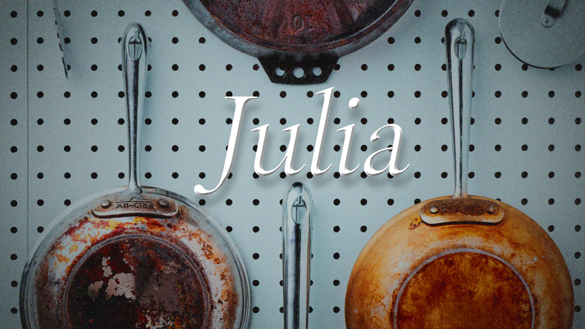
Look 01
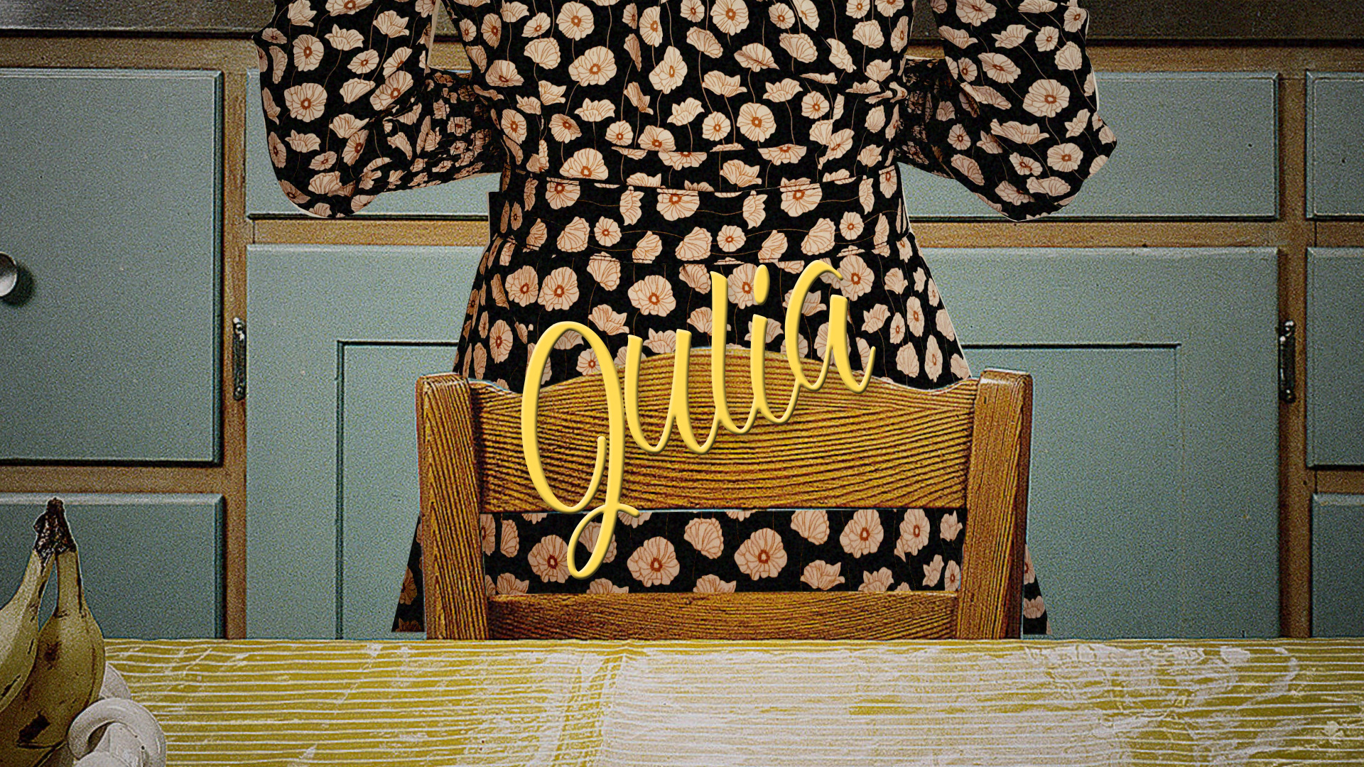
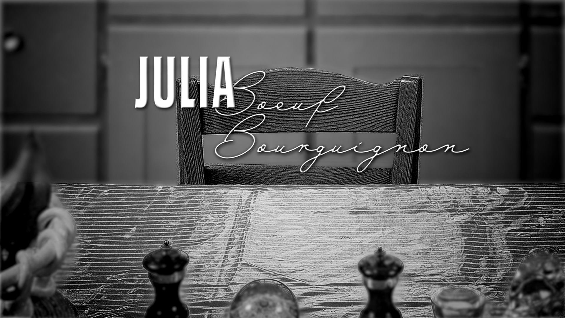
For this look, I was inspired by the idea of transformation and change throughout the series, and using the idea of color as a metaphor and technological adaptation throughout. This change from black and white to color could either happen within each single title sequence, or become more of a durational change where the early episodes of the series begin in black and shite and the final episodes resolve into full color.

Look 02
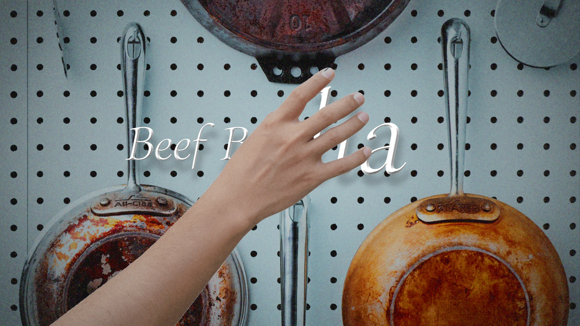
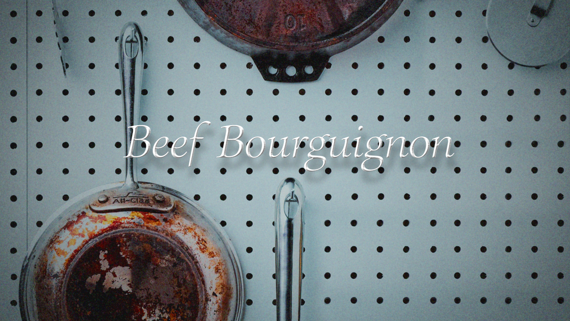
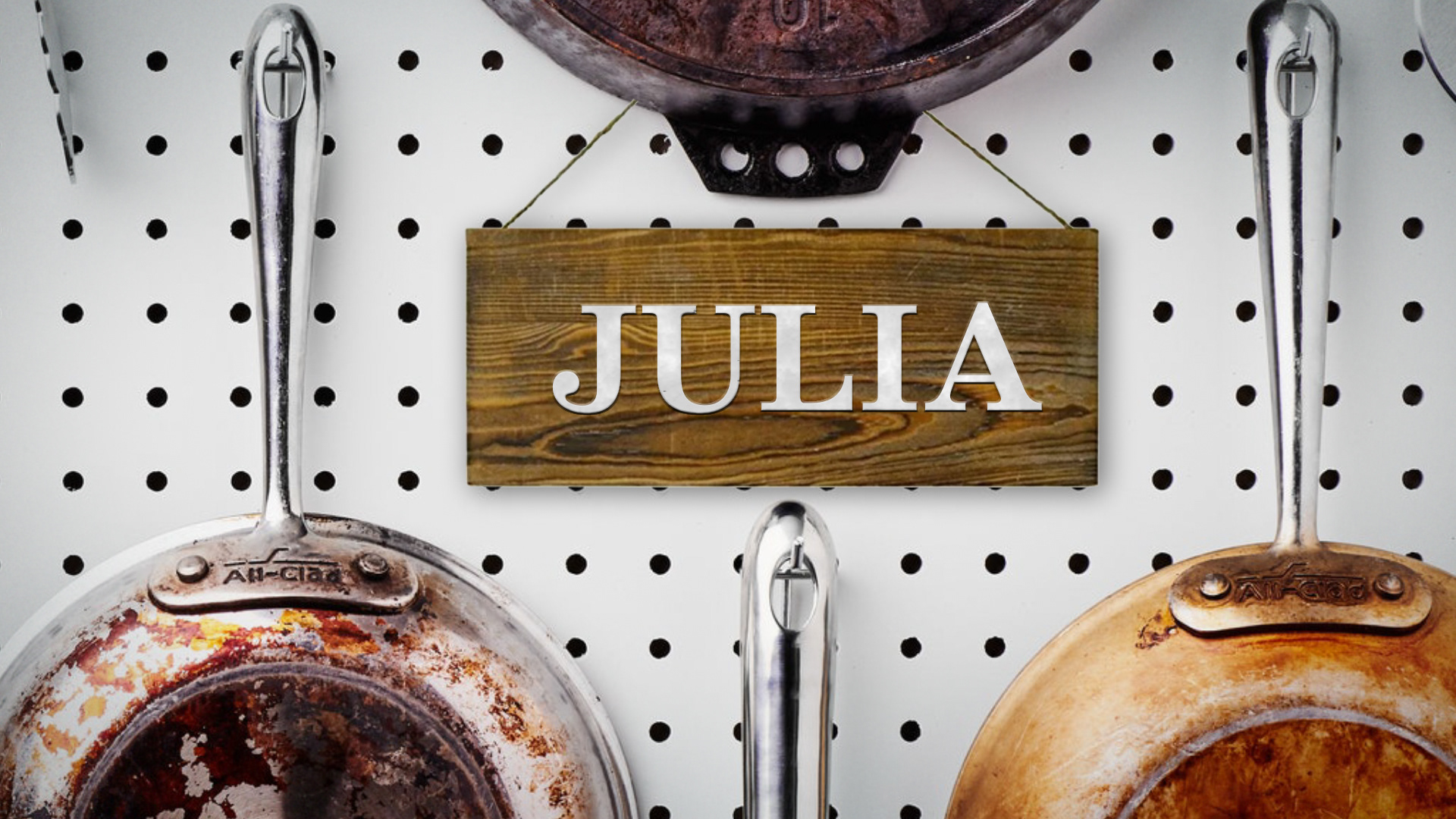
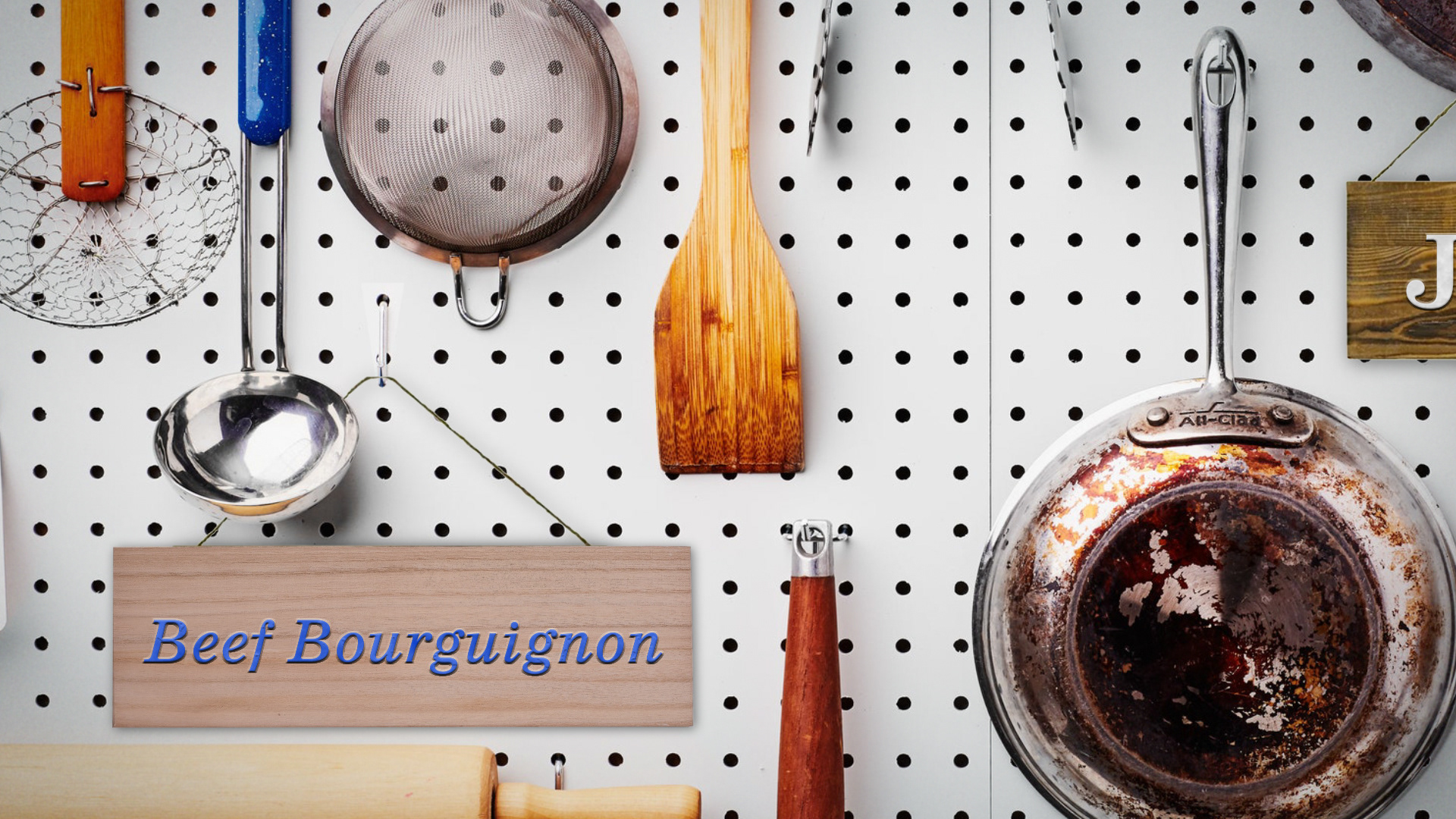
This look is inspired by the simple "wipe" used in Julia Child's The French Chef. We take the iconic peg board and wipe off the main title as we wipe on the episode title.
Look 03
An "alt" on the above title pans across the large peg board from main title to recipe title, providing the same effect as the wipe on without the actual act of wiping on.
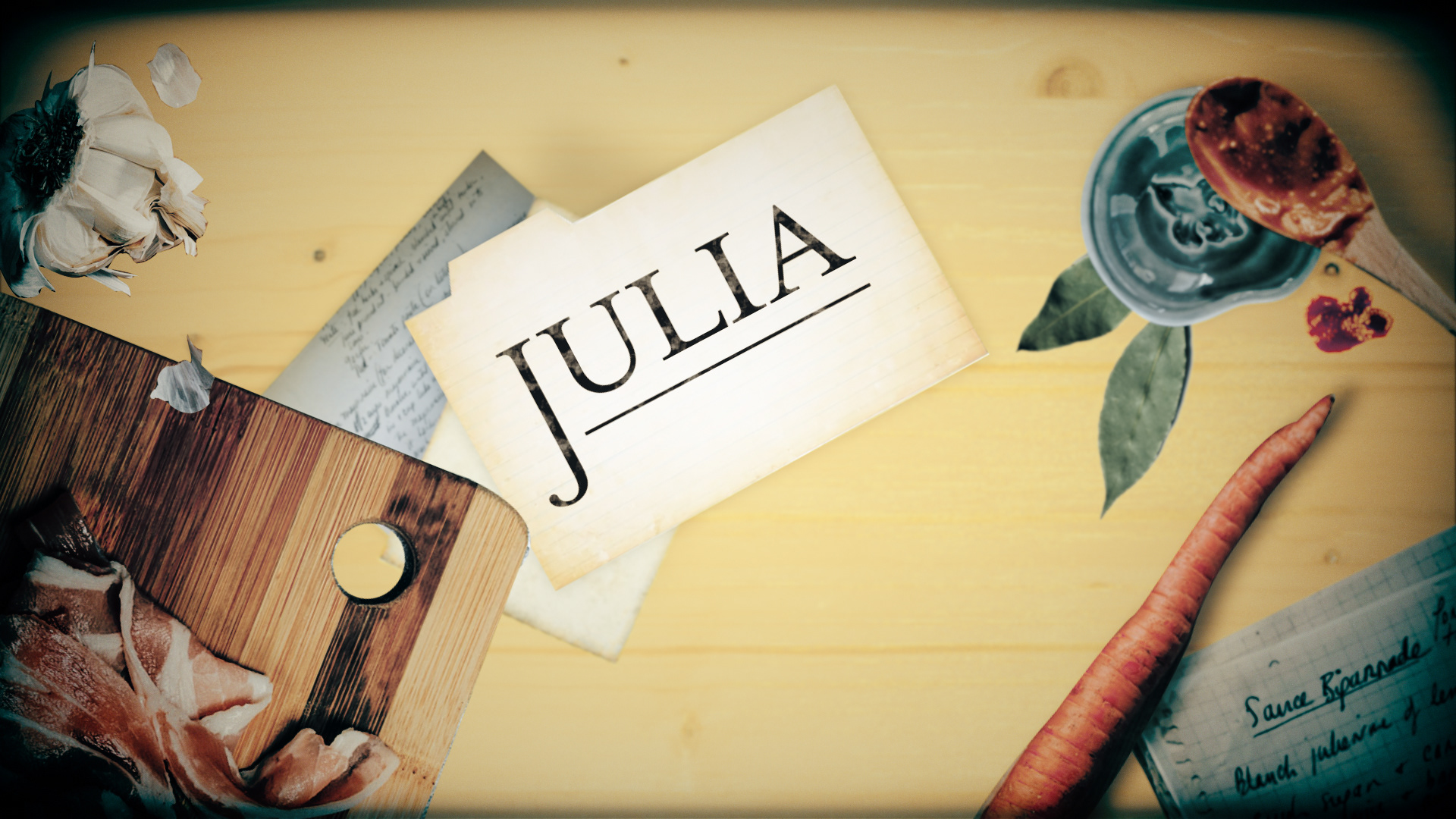
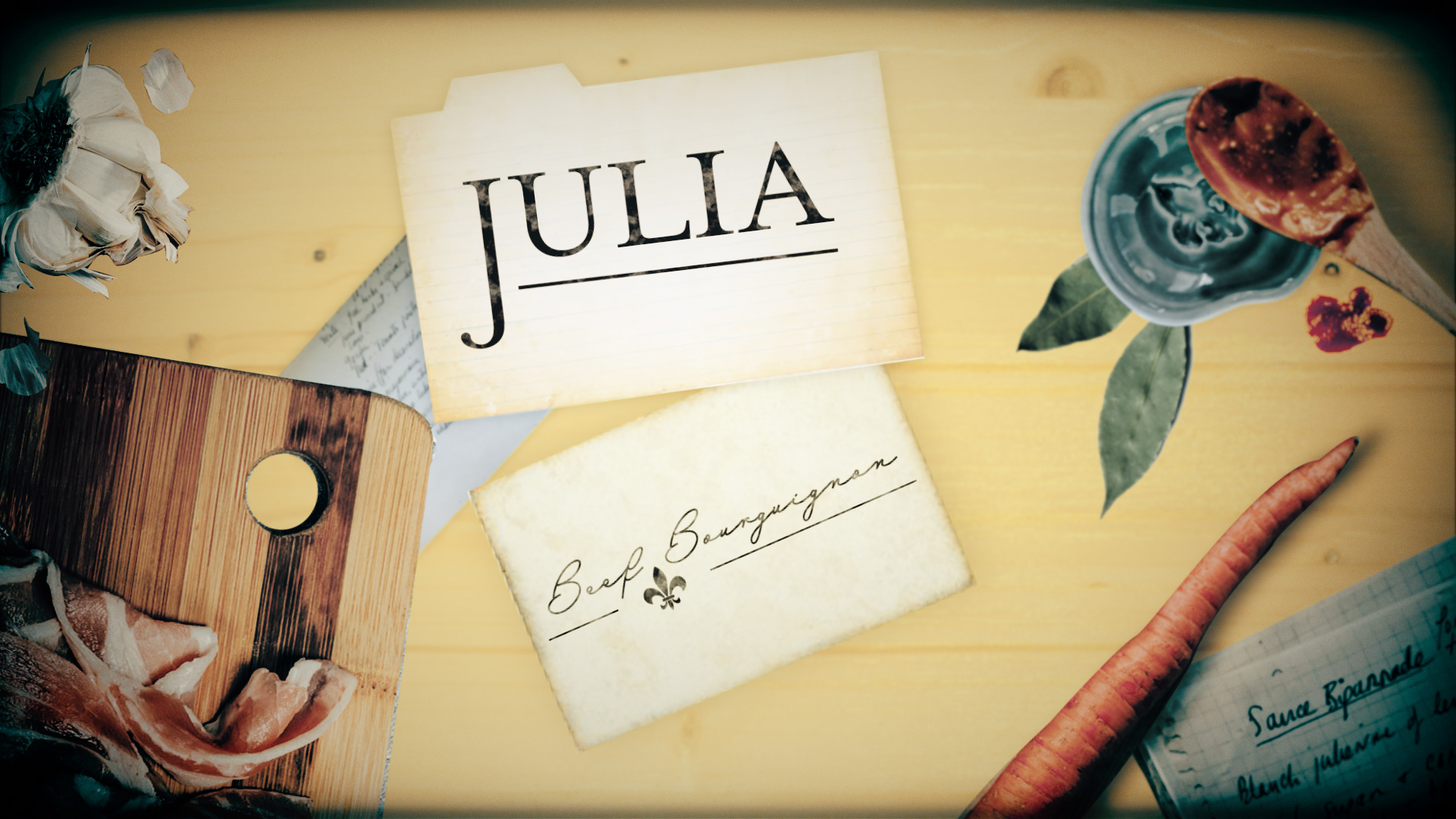
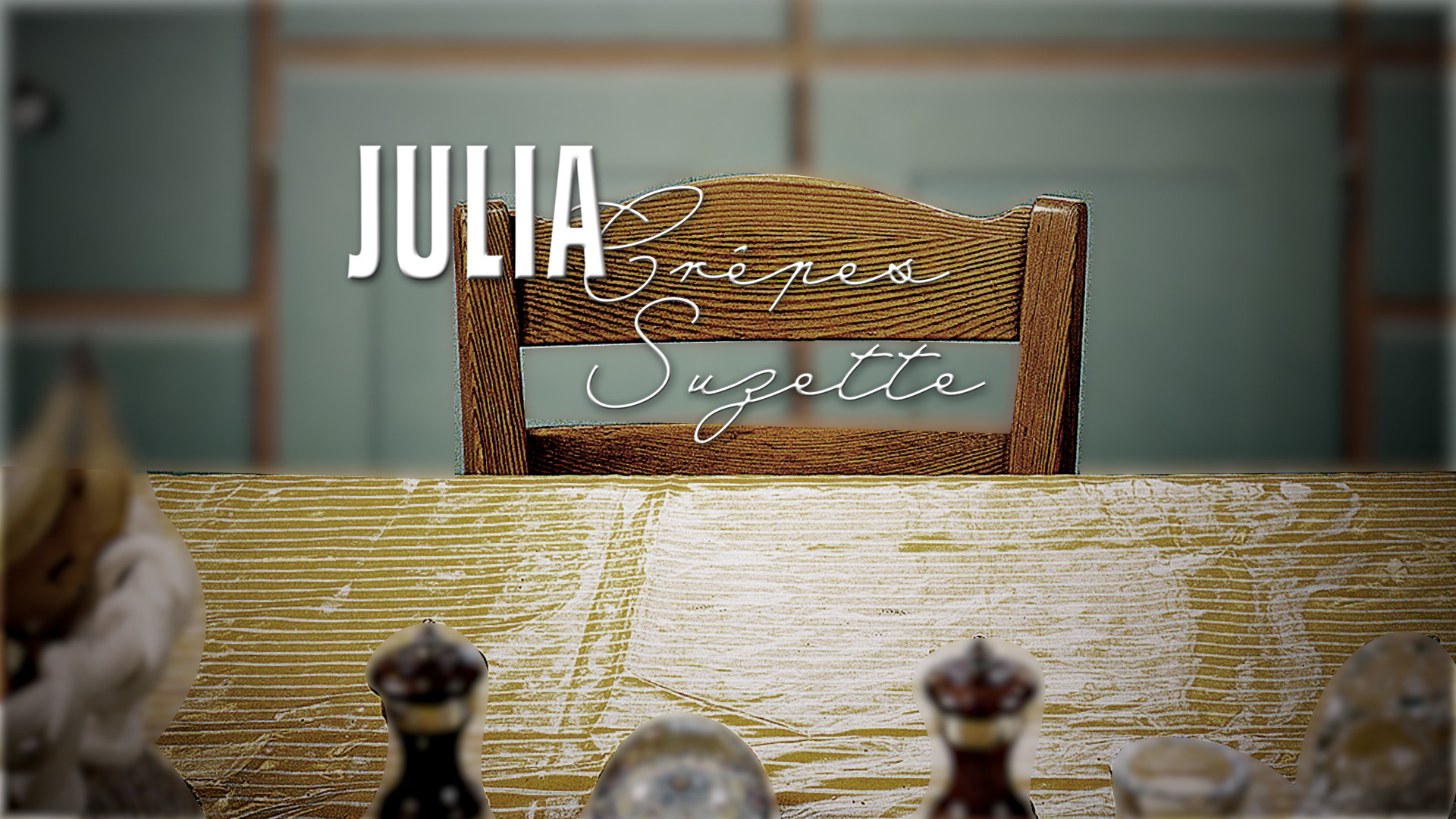
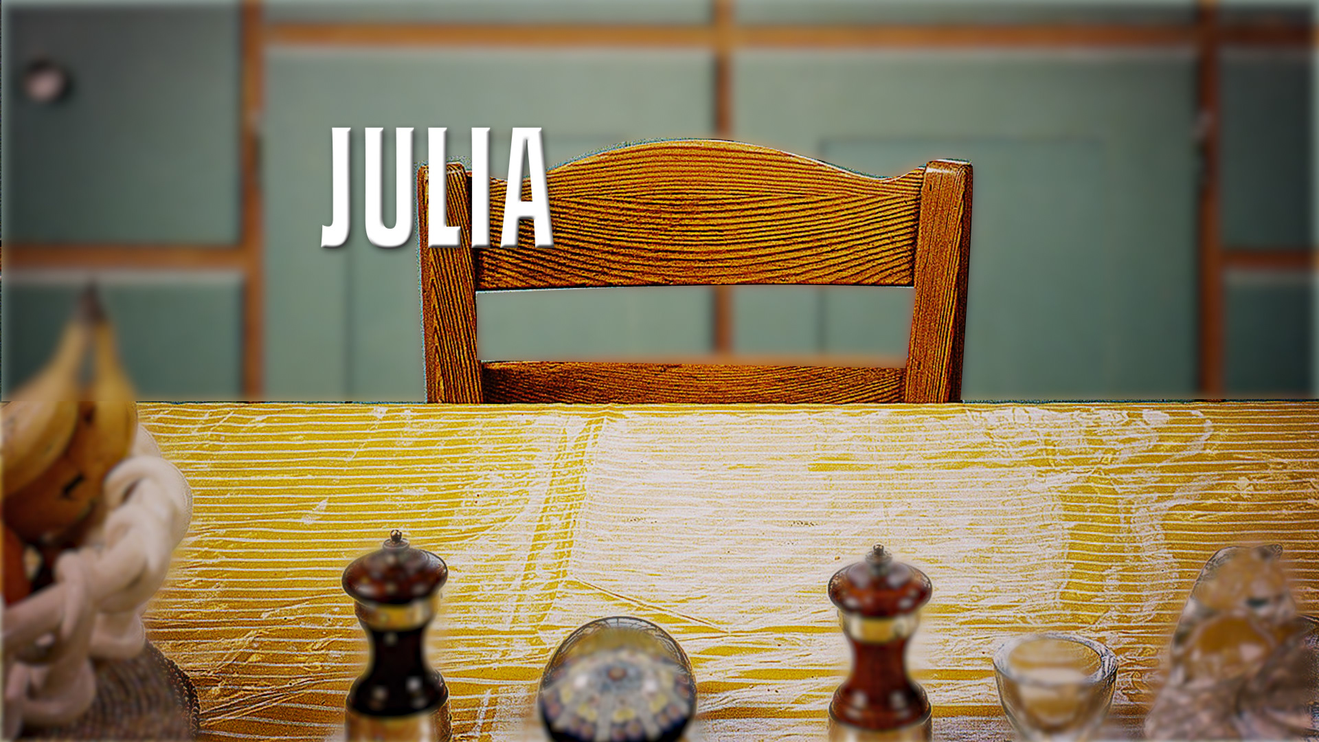
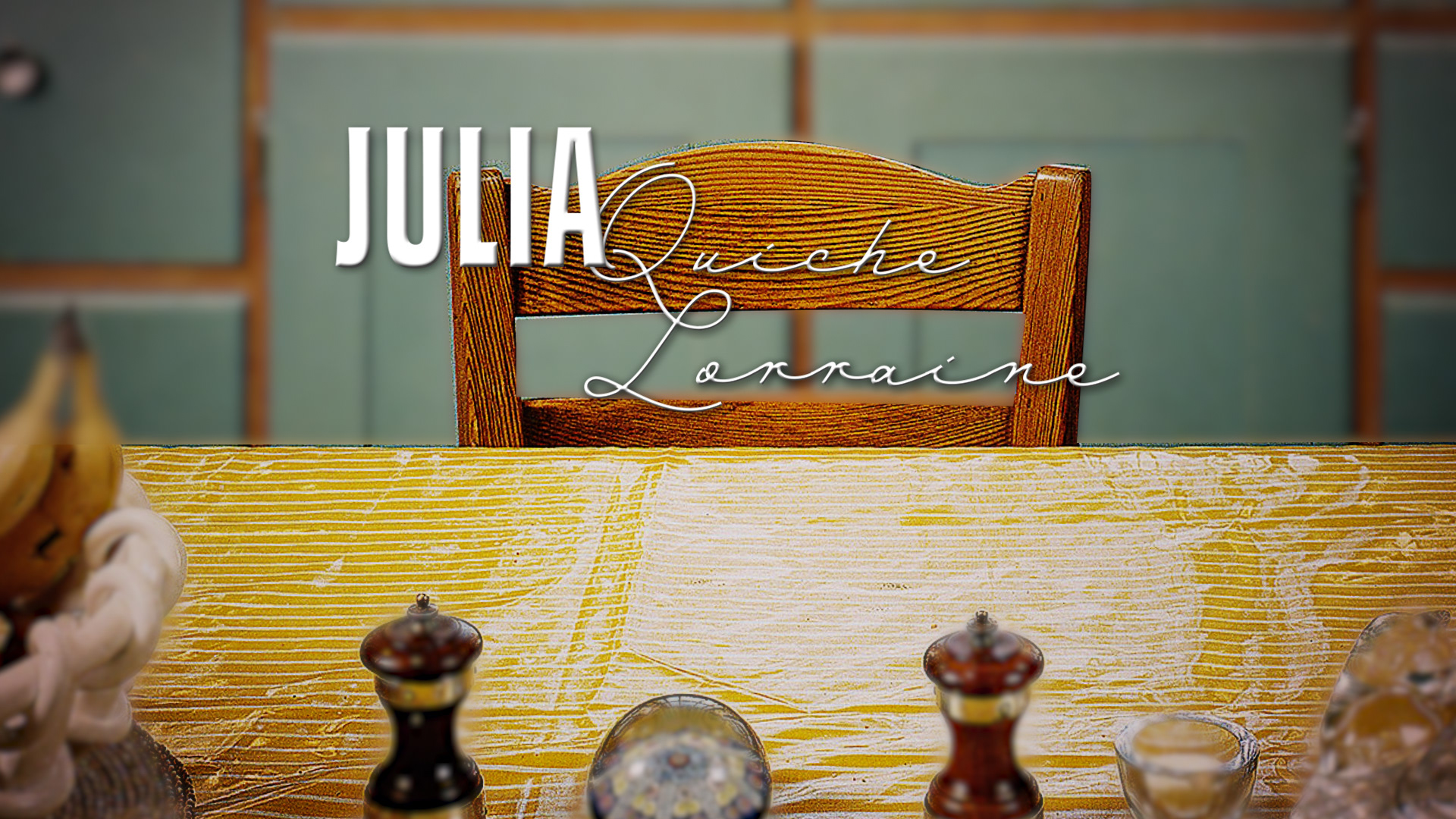
Look 04
Just as Julia Child's shows and recipes were staples in kitchens across America, my last and final look presents Julia as the main and most important ingredient. We see a table full of food items, and then focus in on different recipe cards that reveal the main title and the episode title.